How to Make Branded Social Media Cards for Your Blog or Business
Most bloggers skip branding entirely. The 14% who actually earn do not. Here is the complete system for building branded social media cards that make your content identifiable before anyone reads a single word across three tiers for every skill level.
 By Novarift Staff
A few days ago, we published a piece about the 86% of bloggers who earn nothing and the 14% who do. The article broke down what actually separates the bloggers who build something real from the ones who publish for years and never see a return. The list was specific: email lists, monetisation structure, consistency, audience trust.
But there was one asset on that list we deliberately kept brief: branding. Not because it is less important. Because it deserved its own piece.
Today we are going deeper. If you run a blog, an online store, a newsletter, or any kind of content-driven brand, this is the guide for how to build the one asset that makes people recognise your content before they have even read a word of it: branded social media cards.
You have seen them. Every publication with a real audience uses them. NovaRift uses them. The New York Times uses them. The Financial Times uses them. A card is a square image (usually 1080 by 1080 pixels) that carries your branding, your story image, your category, and your headline. You post it to Instagram, to X, to LinkedIn, to Threads. When someone sees it in their feed, they know immediately who it is from.
This guide builds that system for you across three tiers. Tier 1 is for anyone. A single prompt you paste into Gemini and your card is done. Tier 2 is for the designer. A reusable template in Canva or Photoshop where you swap the image and headline and publish in under five minutes. Tier 3 is for the technical builder. A code pipeline using Satori that generates cards automatically, and for non-coders, the exact prompt you paste into a VSCode agent or Antigravity to build that pipeline for you.
Pick the tier that fits where you are today. You can always move up.
Why Visual Branding Is the One Thing the Top 14% Get Right
Before we get into tools, let us understand why this matters. Because most creators skip branding entirely when they are starting out, and it is one of the most expensive mistakes you can make, not in money, but in time.
Every post you publish without consistent visual branding is a missed compounding opportunity. Here is what that means in practice.
When someone sees your content three or four times without recognising the source, they do not connect those posts to a single brand. Each encounter starts from zero. You are effectively introducing yourself to the same person repeatedly. The familiarity never builds. The trust never accumulates.
Now consider what happens when your content is visually consistent. The third time someone sees your card in their feed, they do not just see a post. They see a publication. Something they have encountered before. Something that, whether they consciously register it or not, carries weight. The human brain is wired to assign credibility to things it recognises. It is not rational. It is neurological.
The top 14% of bloggers and content brands understand this. They are not necessarily better writers. They are not necessarily publishing more often. But their content is immediately identifiable. You scroll past a New York Times card on Instagram and you know before you read a single word that it came from the Times. That is brand equity. It is earned post by post, card by card, over months and years.
The other thing visual consistency does is force you to be selective. When every post has to fit inside a branded template, you stop publishing low-effort content. The template becomes a filter. If a piece is not worth designing a card for, it probably is not worth publishing. That discipline compounds too.
For a blog, branded cards also create social proof out of your own content. A well-designed card shared by one reader signals to their followers that this publication is worth reading. A sloppy screenshot does the opposite.
You do not need a design team. You do not need a budget. You need a system. That is what this article builds.
The Anatomy of a Branded Card: What Makes It Work
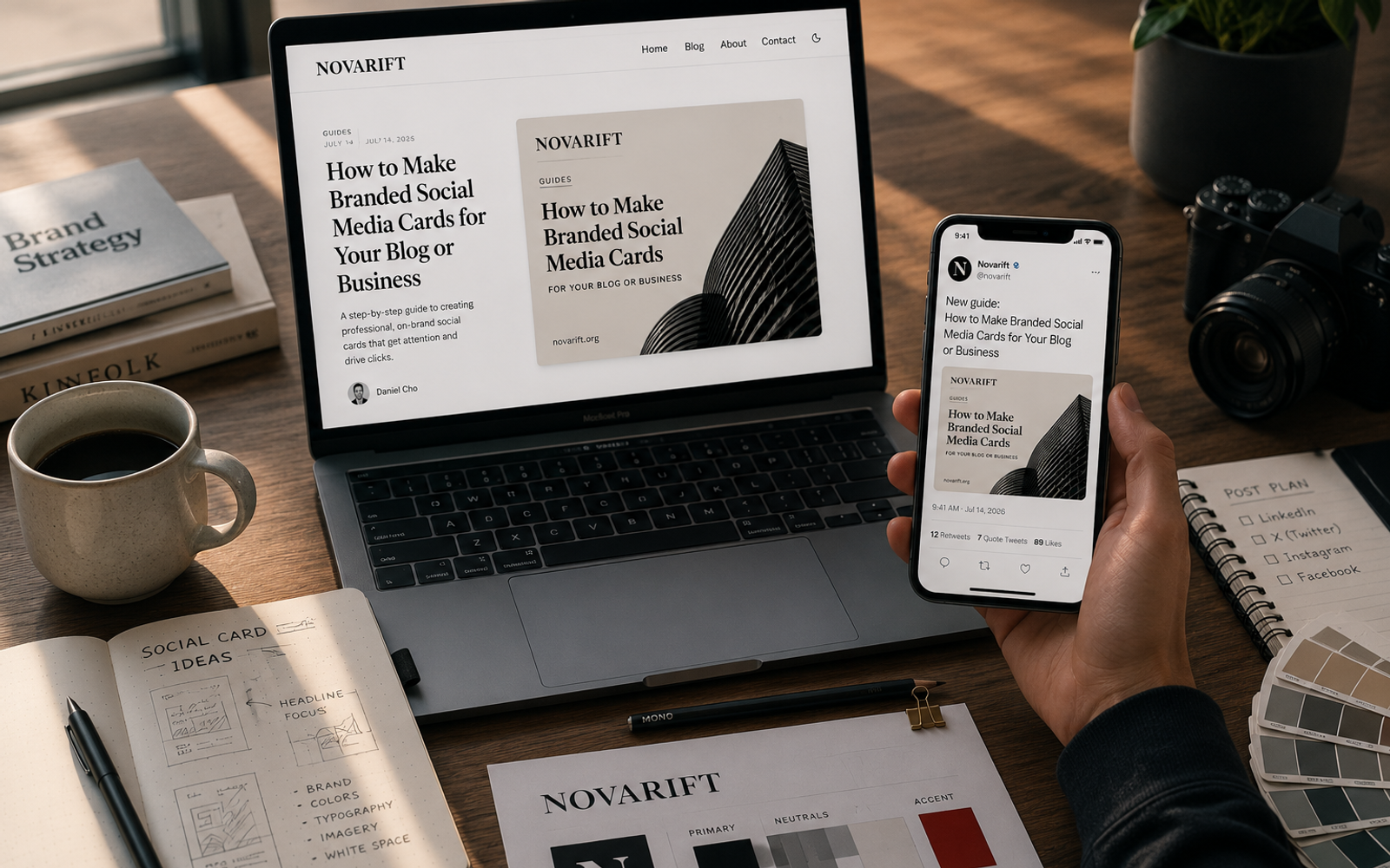
Before you build anything, you need to understand the components. Every effective branded card, regardless of the tool used to make it, shares the same structural logic. Here is how it breaks down, using NovaRift's own cards as the reference.



Look at those three cards. Different topics, different images, different headlines. But identical structure. That is the point. Here is what each component is doing:
The brand name and logo at the top center. This is not decoration. It is a territorial marker. The moment someone sees the card, they know who published it. For NovaRift, it is the wordmark paired with the N icon, centered, with a thin rule beneath it to create visual separation from the rest of the card. Subtle but unmistakable.
The image with rounded corners. The photo is the editorial hook. It makes the card human, specific, and visually interesting. The rounded corners are a design choice that softens the card, making it feel more like a premium editorial product and less like an ad. The image fills roughly 55% of the card's vertical space, which keeps it dominant without overwhelming everything else.
The category badge. This is the small pill or rectangle below the image. In NovaRift cards, the badge color changes by category: blue for Technology, orange for Entrepreneurship, green for Markets. This does two things simultaneously. It organises the content and it reinforces the brand's color system. A reader who follows NovaRift across multiple categories starts to associate colors with topics. That is trained visual recognition.
The headline with the color-split treatment. This is NovaRift's most distinctive typographic choice. The first two or three words of the headline appear in the category accent color. The rest appears in black. It creates a natural reading hierarchy and visual tension without needing a subheading. It also makes the card scannable: the colored words act as an anchor for the eye.
The domain or wordmark at the bottom. A small, quiet attribution. "novarift.org" in light gray or the N logo badge in the corner. This matters for shares: when someone screenshots and reposts your card, your brand is baked into the image. You cannot be cropped out.
That is it. Six elements, one system. Every card NovaRift publishes uses this exact structure. Your card will use a different color, a different logo, a different font. But the same bones.
| Card Element | Purpose | Example (NovaRift) |
|---|---|---|
| Brand name / logo (top center) | Immediate brand attribution | "NOVARIFT" wordmark + N icon |
| Story image (rounded corners) | Editorial hook, human interest | Full-width photo, ~55% height |
| Category badge (color pill) | Content taxonomy, color system | Orange for Entrepreneurship |
| Headline (color-split) | Reading anchor, visual tension | First 3 words in accent color |
| Domain attribution (bottom) | Survives cropping and reshares | novarift.org or N badge |
Before You Pick a Tool: Define Your Brand Foundation First
Regardless of which tier you use (AI, design tool, or code) you are going to need to answer three questions before you open anything. These are not optional. Getting them wrong means building on a shaky foundation that will need rebuilding later.
Question 1: What is your primary color?
Pick one. Not two, not three. One primary brand color that will appear on your category badge and your headline accent words. This color needs to be specific. Not "blue," but a specific hex code like #2563EB. If you do not already have a color in mind, here is a simple framework: look at the two or three brands you most respect in your category. What feeling do their colors create? Match the feeling, not the color.
A few starting points by content type:
| Brand Type | Color Direction | Why It Works |
|---|---|---|
| Finance / business | Deep navy, forest green | Trust, stability, authority |
| Health / wellness | Warm terra cotta, sage green | Calm, organic, approachable |
| Technology | Electric blue, sharp purple | Innovation, precision, forward |
| Lifestyle / culture | Warm orange, muted gold | Energy, warmth, personality |
| News / editorial | Red, ink black | Urgency, clarity, tradition |
Question 2: What is your font?
You need one display font for your headline. Not a system font like Arial or Times New Roman. Those signal amateur. A deliberately chosen font signals craft. The good news is that all the best options are free.
For a clean editorial feel: Inter, DM Sans, or Satoshi. For something with more personality: Fraunces, Playfair Display, or Cabinet Grotesk. For something bold and modern: Space Grotesk or Syne.
Pick one and use it on every card, forever. Consistency is more important than perfection.
Question 3: Do you have a logo or wordmark?
If you have a proper logo file (SVG or PNG with transparent background), use it. If you do not, your brand name in your chosen font, all caps, is a perfectly legitimate wordmark. NovaRift uses both: the N icon for space-constrained placements and the full wordmark when there is room. You do not need to spend money on a logo to start.
Write these three answers down before you move to any tier:
Brand name:       _______________
Primary color:    _______________  (hex code, e.g. #2563EB)
Display font:     _______________
Logo file path:   _______________ (or "wordmark only")
Website URL:      _______________
That document is your brand brief. Every tier will ask you for this information.
Tier 1 - The AI Method: Generate Branded Cards with Gemini
Who this is for: Anyone who wants a branded card without opening a design tool or writing code. Bloggers, store owners, solopreneurs who are just getting started or who need a card quickly for a one-off post.
What you get: A generated image you can download, save, and post. It will not be pixel-perfect. It will not be as consistent post to post as a proper template. But it will be branded, it will be intentional, and it will be yours. For someone starting from zero, that is an enormous step forward.
How it works: Gemini can design a social media card if you give it precise enough instructions. Vague prompts produce vague results. The prompt below is structured to give the AI every variable it needs to produce something you can actually use.
The Tier 1 Prompt - Paste This Into Gemini
Copy the block below, fill in the bracketed fields with your brand details, and paste it directly into Gemini. Do not paraphrase it. The specificity is the point.
I need you to design a branded social media card for my business.
Here are my exact brand specifications:

- Business name: [Your Brand Name, e.g. "The Daily Bloom"]
- Website: [yourwebsite.com]
- Primary brand color (hex): [e.g. #16A34A]
- Font style: [e.g. "bold modern sans-serif" or "elegant serif"]
- Category or section this card is for: [e.g. "Finance Tips"]
- Post headline: [Your full headline, e.g. "How We Went From 0 to
  10,000 Subscribers in Eight Months"]

Card design specifications:
- Size: 1080 x 1080 pixels (square)
- Background: clean white
- Layout (top to bottom):
  1. Brand name "[Your Brand Name]" centered at the top in small
     caps, with a thin horizontal rule below it
  2. A relevant photo for this topic (you choose, editorial style,
     with rounded corners)
  3. A small rectangular badge below the photo containing the word
     "[Category Name]" in white text, background in [primary color],
     all caps, small font
  4. The headline in large bold text. First 3 words in [primary
     color], rest of headline in black
  5. Website URL "[yourwebsite.com]" in small light gray text
     at the bottom left
  6. A small circular logo badge at the bottom right containing
     the first letter of my brand name in white on [primary
     color] background

Style: editorial, minimalist, premium news publication.
Clean white space. No gradients. No shadows. No decorative elements.
Iterating on the Output
If the first result is not quite right, do not start over. Respond to Gemini with specific corrections:
- "The font is too thin, make the headline heavier and bolder"
- "The category badge should be a horizontal pill, not a circle"
- "The brand name at the top needs more letter-spacing"
AI image generation improves dramatically with iterative feedback. Three or four rounds of specific corrections will get you close to something usable.
Tier 1 Limitations
Be honest with yourself about what Tier 1 cannot do consistently:
- The layout will shift slightly between cards, because the AI regenerates everything from scratch each time
- The font will not be an exact match to your chosen font; the AI approximates
- Color accuracy can vary between generations
For a single card or an occasional post, Tier 1 is fast and sufficient. For a publication that posts multiple times a week, the inconsistency becomes a problem. That is when you move to Tier 2.
Tier 2 - The Template Method: Canva and Photoshop
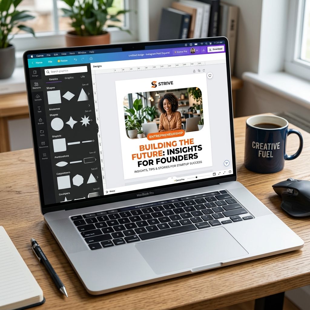
Who this is for: Bloggers and brand owners who post regularly and want every card to look identical post to post. You do not need design experience. You need patience to build the master template once, and after that, each new card takes five minutes.
What you get: A reusable template where you swap the photo and the headline text, and the entire branded card is instantly ready to download and post. The brand name, badge, colors, fonts, logo: everything stays locked in place.
Building Your Master Template in Canva
Canva is the right tool for most people at this tier. It is free (the features you need are all in the free plan), it runs in a browser, and templates are saveable and reusable without any software to install.
Step 1: Create a new design at 1080 x 1080px. In Canva, click "Create a design," then "Custom size," and enter 1080 by 1080 pixels. This is the standard square for Instagram, Threads, and X.
Step 2: Set the background to white. Click the background area, select "Color," and enter FFFFFF. Lock this layer so it never accidentally moves.
Step 3: Add your brand name at the top. Insert a text box. Type your brand name in all caps. Set the font to your chosen display font. Set the size to around 22 to 26px. Set the letter-spacing wide (in Canva, drag the spacing slider to the right). Center it horizontally. Position it about 48px from the top edge. Add a thin horizontal line (1px height) directly below it, the same color as your brand name, about 80% of the card's width, centered. This is the rule that separates your brand identity from the card content below.
Step 4: Add the photo placeholder. Insert a rectangle that is approximately 984px wide and 540px tall. Set the corner radius to 16px for the rounded corners. Position it centered, roughly 96px from the top. This is your image placeholder. Each time you make a new card, click this rectangle and "replace" it with your new image. Canva will crop it to fit automatically.
Step 5: Add the category badge. Insert a rectangle below the image. Set it to about 160px wide by 28px tall. Set the corner radius to 4px. Fill it with your primary brand color. Add a text layer on top of it: your category name in white, all caps, 11px, bold, letter-spacing wide. Group the badge and its text together so they move as one element.
If you publish across multiple categories like NovaRift does, duplicate this badge for each category and change the color. Keep all versions in your template as hidden layers. When you make a card, unhide the badge for the relevant category.
Step 6: Add the headline. Insert a text box below the badge. Set the font to your display font, bold weight, around 44 to 52px. This is your headline layer. For the color-split treatment (first few words in your brand color, rest in black), manually highlight the first two or three words and change their color each time. It takes about ten seconds.
Step 7: Add the bottom attribution. Bottom-left: your website URL in light gray (try #9CA3AF), around 11px, the same font. Bottom-right: your logo badge. If you have a logo PNG, insert it and resize to roughly 48px square. If you are using a wordmark initial, insert a circle, fill it with your primary color, and add your brand initial in white.
Step 8: Save the template. In Canva, go to File > Save. Give it a name like "Brand Card Master Template." Every time you need a new card, open this template, click "Make a copy," update the photo and headline on the copy, and download as a PNG.
Never edit the master directly. Always work from a copy.
The Photoshop Approach
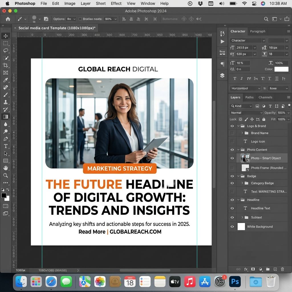
If you already use Photoshop, the process is nearly identical but uses Smart Objects instead of placeholder rectangles. The advantage of Photoshop is pixel-perfect control and the ability to use your exact font file rather than Canva's approximation.
The key Photoshop-specific step: make your photo layer a Smart Object (right-click the layer > Convert to Smart Object). This allows you to double-click the layer, swap the image, and have Photoshop automatically crop and fit it to the same dimensions every time. The rest of the template (badge, headline text layers, logo, brand name) stays untouched.
The Tier 2 Weekly Workflow
Once your master template exists, this is what every post looks like:
- Open Canva (or Photoshop), duplicate the master template
- Replace the photo with your new story image
- Update the headline text
- Switch the category badge color if the category changed
- Download as PNG
- Post
The whole process, once the template is built, takes between three and seven minutes per card. That is the Tier 2 advantage: you pay the cost of setup once, and every card after that is nearly free.
Tier 3 - The Code Method: Satori and VSCode
Who this is for: Developers, technical bloggers, or anyone running a website on a code stack who wants to generate branded cards automatically with no Canva tab and no manual steps. Also for non-coders who are willing to use a VSCode agent or Antigravity to build the pipeline for them. The non-coder path is covered at the end of this section.
What you get: A script you run from your terminal. You give it three inputs (an image URL, a category, and a headline) and it generates a branded PNG card. Every card is pixel-perfect and identical in layout because the code never forgets your specifications.
What Satori Is
Satori is an open-source library built by Vercel. It converts JSX (React-style HTML elements) into SVG images. You describe your card layout in code (position, fonts, colors, spacing) and Satori renders it as a vector. You then convert that SVG to a PNG using a companion library called @resvg/resvg-js.
The reason Satori is the right tool for this is reliability. Design tools can drift: fonts render slightly differently, spacing shifts, images resize unpredictably. Satori renders from exact specifications in code. If your primary color is #F97316, every card forever will use exactly #F97316. If your headline font is Inter Bold at 48px, every card forever will use exactly that.
For Coders: The Working Script
Install the required libraries first:
npm install satori @resvg/resvg-js
Download the Inter Bold font from Google Fonts and save it as Inter-Bold.ttf in your project folder. Then create a file called generate-card.js and paste the following:
import satori from 'satori';
import { Resvg } from '@resvg/resvg-js';
import { readFileSync, writeFileSync } from 'fs';

// --- Your Brand Configuration ---
const BRAND_NAME    = 'YOUR BRAND NAME';   // e.g. 'NOVARIFT'
const WEBSITE_URL   = 'yourwebsite.com';
const PRIMARY_COLOR = '#F97316';           // Your brand hex color
const FONT_PATH     = './Inter-Bold.ttf';
const CARD_SIZE     = 1080;

// Category colors (add or edit as needed)
const CATEGORY_COLORS = {
  'Technology':       '#2563EB',
  'Entrepreneurship': '#F97316',
  'Markets':          '#16A34A',
  'Culture':          '#8B5CF6',
  'Default':          PRIMARY_COLOR,
};

// CHANGE THESE THREE LINES FOR EACH NEW CARD
const imageUrl = 'https://your-image-url.jpg';
const category = 'Entrepreneurship';
const headline = 'How We Built a Brand From Zero Without a Design Budget';
// ---

const fontData    = readFileSync(FONT_PATH);
const accentColor = CATEGORY_COLORS[category] ?? CATEGORY_COLORS['Default'];

const words          = headline.split(' ');
const accentWords    = words.slice(0, 3).join(' ');
const remainingWords = words.slice(3).join(' ');

const svg = await satori(
  {
    type: 'div',
    props: {
      style: {
        width: CARD_SIZE, height: CARD_SIZE,
        background: 'white', display: 'flex',
        flexDirection: 'column', alignItems: 'center',
        padding: '48px', fontFamily: 'Inter',
        boxSizing: 'border-box',
      },
      children: [
        // Brand name
        {
          type: 'div',
          props: {
            style: {
              fontSize: 22, fontWeight: 700,
              letterSpacing: '0.25em', color: '#111',
              marginBottom: '12px',
            },
            children: BRAND_NAME,
          },
        },
        // Thin rule
        {
          type: 'div',
          props: {
            style: {
              width: '80px', height: '1px',
              background: '#111', marginBottom: '28px',
            },
          },
        },
        // Story image
        {
          type: 'img',
          props: {
            src: imageUrl,
            style: {
              width: '984px', height: '520px',
              borderRadius: '16px', objectFit: 'cover',
            },
          },
        },
        // Category badge
        {
          type: 'div',
          props: {
            style: {
              background: accentColor, color: 'white',
              padding: '6px 18px', borderRadius: '4px',
              fontSize: 11, fontWeight: 700,
              letterSpacing: '0.15em',
              marginTop: '28px', marginBottom: '18px',
            },
            children: category.toUpperCase(),
          },
        },
        // Headline: accent words + black words
        {
          type: 'div',
          props: {
            style: {
              display: 'flex', flexWrap: 'wrap',
              justifyContent: 'center', fontSize: 46,
              fontWeight: 800, lineHeight: 1.1,
              textAlign: 'center', maxWidth: '920px',
            },
            children: [
              {
                type: 'span',
                props: {
                  style: { color: accentColor, marginRight: '10px' },
                  children: accentWords,
                },
              },
              {
                type: 'span',
                props: {
                  style: { color: '#111' },
                  children: remainingWords,
                },
              },
            ],
          },
        },
        // Bottom row
        {
          type: 'div',
          props: {
            style: {
              display: 'flex', justifyContent: 'space-between',
              alignItems: 'flex-end', width: '100%',
              marginTop: 'auto', paddingTop: '16px',
            },
            children: [
              {
                type: 'span',
                props: {
                  style: { fontSize: 12, color: '#9CA3AF' },
                  children: WEBSITE_URL,
                },
              },
              {
                type: 'div',
                props: {
                  style: {
                    width: '44px', height: '44px',
                    borderRadius: '50%', background: '#111',
                    display: 'flex', alignItems: 'center',
                    justifyContent: 'center', color: 'white',
                    fontSize: 20, fontWeight: 800,
                  },
                  children: BRAND_NAME[0],
                },
              },
            ],
          },
        },
      ],
    },
  },
  {
    width: CARD_SIZE, height: CARD_SIZE,
    fonts: [{ name: 'Inter', data: fontData, weight: 700, style: 'normal' }],
  }
);

const resvg = new Resvg(svg, { fitTo: { mode: 'width', value: CARD_SIZE } });
writeFileSync('./card.png', resvg.render().asPng());
console.log('Card generated: card.png');
Run it with:
node generate-card.js
Your card appears as card.png in the same folder. Change the three lines under "CHANGE THESE THREE LINES FOR EACH NEW CARD" for every new post.
For Non-Coders: The Antigravity or VSCode Agent Prompt
You do not need to understand any of the code above. If you have Antigravity open or a VSCode agent available, paste the following prompt exactly as written. The agent will build the entire project for you, including the file structure, the package installation, and step-by-step instructions for how to use it.
I want to build a branded social media card generator using Satori
and Node.js. Please build the complete working project for me.

My brand details:
- Brand name: [Your Brand Name, e.g. "The Daily Bloom"]
- Website: [yourwebsite.com]
- Primary color: [hex code, e.g. #16A34A]
- Categories and their accent colors:
    [Category 1]: [hex color]
    [Category 2]: [hex color]
    (add as many categories as you need)
- Font: Inter Bold (free on Google Fonts)

Build me:
1. A Node.js script called generate-card.js that:
   - Has a clearly labeled section at the top: "CHANGE THESE
     THREE LINES FOR EACH NEW CARD" with imageUrl, category,
     and headline as the only inputs I need to touch
   - Generates a 1080x1080 PNG card using Satori plus @resvg/resvg-js
   - Layout (top to bottom): brand name in small caps centered
     at top with a thin horizontal rule beneath it, full-width
     image with 16px rounded corners, colored category badge
     in accent color, bold headline with first 3 words in the
     accent color and the rest in black, website URL at bottom
     left in gray, small circular brand initial badge at
     bottom right in black
   - Saves the output as card.png in the same folder

2. A package.json with the correct dependencies

3. A README.md with exact instructions:
   - How to install (npm install)
   - Where to put the Inter-Bold.ttf font file
   - How to run (node generate-card.js)
   - How to change the image, category, and headline each time
The agent will build all three files and walk you through the setup. Once it is done, every new card is three line changes and one terminal command.
How to Write Card Headlines That Stop the Scroll
The design of your card is the container. The headline is the reason someone stops scrolling.
A card headline is not the same as an article title. It has to work in two to three seconds, often without the reader intending to stop. Here is what that means in practice.
Lead with tension, not information. An informational headline tells people what the article contains. A tension headline makes them feel like they are already behind.
| Informational (weak) | Tension-based (strong) |
|---|---|
| "Five Tips for Growing Your Email List" | "Most Bloggers Build the Wrong List. Here Is How to Build the Right One." |
| "How to Use Canva for Business" | "The Canva Feature Nobody Uses Is the One That Saves Hours Every Week" |
| "Why Branding Matters for Small Business" | "The Brand That Earns Nothing and the Brand That Earns Everything Look Almost Identical. At First." |
The color-split forces a deliberate word choice. The first two or three words of your headline appear in your accent color. They are the visual anchor. Pick them deliberately. In NovaRift cards, the accent words are almost always the subject: the name, the number, the entity. Not a verb, not a filler word. The eye lands on the colored text first, processes it, then reads forward. The structure guides the reading direction without the reader noticing.
Specificity makes people trust the click. "How to grow your business" is forgettable. "How we went from 400 to 22,000 Instagram followers without paid ads" is specific enough to feel credible. Specificity signals that the writer has actually done the thing they are writing about.
Test your headline with this question: If someone saw only the first three words in your accent color, would they know what this story is about? If the answer is no, rearrange until it is yes.
Your Weekly Posting Workflow: Article to Card in Five Minutes
The goal of a branded card system is not to create beautiful individual cards. It is to create a workflow so repeatable that making a card stops being a decision and becomes a habit.
Here is what the workflow looks like per tier once your system is set up:
Tier 1 Workflow (AI method):
- Finish your article or post
- Open Gemini
- Paste your saved Tier 1 prompt, fill in the image description, category, and headline
- Download the generated image
- Post
Time per card: 5 to 10 minutes.
Tier 2 Workflow (Template method):
- Finish your article or post
- Find your story image (Unsplash, your own photo, or a press image)
- Open Canva, duplicate the master template
- Replace the image and update the headline text
- Switch the category badge if needed
- Download as PNG
- Post
Time per card: 3 to 7 minutes once the master template is built.
Tier 3 Workflow (Code method):
- Finish your article or post
- Open generate-card.js
- Change the three input lines
- Run
node generate-card.js - Post card.png
Time per card: 60 to 90 seconds.
One habit that multiplies all three tiers: batch your cards. If you publish five times a week, set aside one 30-minute block at the start of the week and produce all five cards in one session. The decisions are faster, the rhythm is better, and your cards are ready before you need them.
The Branding Mistakes That Make Cards Look Amateur
Once your system is built, the fastest way to undermine it is to make one of these mistakes. They are common. They are fixable.
1. More than two colors. Your card needs one accent color, black, and white. The moment you introduce a second accent color, even once, the card looks confused. Every color added competes for attention.
2. Inconsistent fonts. If fifty cards use Inter Bold but thirteen use a font you liked that week, the brand breaks. The font is structural. Lock it in and do not change it.
3. No breathing room. Padding is not wasted space. The gap between your brand name and the image, between the badge and the headline: that white space makes the card feel premium. Cards that fill every pixel feel like ads.
4. A headline that is too long. Card headlines should be six to twelve words. Longer, and the font shrinks to fit, the visual weight drops, and the card becomes harder to scan. Write a shorter card-specific version if your article title is long.
5. Inconsistent logo placement. If your logo moves between cards (sometimes bottom-right, sometimes bottom-left, sometimes missing) there is no brand. Pick a position. Keep it forever.
6. Not saving the master template. Every time you work from a modified copy instead of the locked master, drift creeps in. The master is sacred. The copy is disposable.
7. Using a blurry or compressed image. The image is the first thing the eye processes. A pixelated photo makes the entire card look low-quality regardless of the rest of the design. Use images at minimum 1080px wide from Unsplash, Pexels, or your own camera. Never screenshot an image and paste it.
When to Move Up a Tier
There is no rule that says you must move through all three tiers. Many successful brands run on Tier 2 indefinitely. But there are specific signs that a tier is no longer serving you.
Move from Tier 1 to Tier 2 when:
- You post more than twice a week and the inconsistency between AI-generated cards is noticeable
- You are spending more than fifteen minutes per card trying to get the AI result right
- Someone else on your team occasionally needs to make a card, and the AI prompt does not produce the same result for them
Move from Tier 2 to Tier 3 when:
- You publish enough that the five-minute Canva workflow has become a genuine bottleneck
- You have a developer on your team who can own and maintain the pipeline
- You want card generation to happen automatically when you publish a new article, with no manual step at all
- You run a publication with multiple contributors who each need to generate cards quickly and consistently
The code tier becomes genuinely transformative when you connect it to your CMS. Every time a new article is published in Sanity, Contentful, or Ghost, a webhook triggers the Satori script, the card is generated and uploaded to your media library, and it is ready to post before you have even opened Instagram.
That is the end state. It is not where anyone starts. But every decision you make at the earlier tiers (your brand color, your font, your headline structure) carries forward into that system unchanged. Build the foundation right. The upgrade will be there when you need it.
Frequently Asked Questions
What size should a branded social media card be?
1080 by 1080 pixels is the standard square format for Instagram, Threads, and X. Some platforms support 1080 by 1350 (portrait) for Instagram feeds, but the square works universally across every platform. When building a single template you plan to reuse indefinitely, always start with the square.
Do I need design skills to make branded social media cards?
No. Tier 1 in this guide requires only the ability to paste a prompt into Gemini. Tier 2 (Canva) is built for non-designers and takes about an hour to set up the first time. Tier 3 even has a non-coder path where you paste a prompt into an AI agent and it builds the entire code pipeline for you.
What is the difference between using Canva and Satori for branded cards?
Canva is a browser-based design tool where you build a visual template manually and swap the image and headline each time you post. Satori is a code library that generates cards from a script, so the output is identical every time without any manual work. Canva is better for non-technical users who want visual control; Satori is better for developers who want speed, precision, and the option to automate card generation entirely.
What font should I use for my branded social cards?
Inter Bold is the most versatile starting point and is used by many editorial brands. For a cleaner editorial feel, DM Sans or Satoshi work well. For more personality, Fraunces or Playfair Display are strong choices. The specific font matters less than the commitment to using the same one on every single card. Changing fonts between posts breaks brand consistency faster than any other mistake.
Can I use the Satori method if I do not know how to code?
Yes. The guide includes a complete prompt you can paste directly into Antigravity or a VSCode agent. The AI builds the entire project for you including the script, the package.json, and a README with exact instructions. Once it is set up, making a new card means changing three lines in the file and running one command in your terminal.
How many colors should a branded social card use?
Three: your primary accent color, black, and white. The accent color goes on the category badge and the first two or three words of the headline. Black handles the rest of the headline and all secondary text. White is the background. Introducing a second accent color, even just once, makes the card look visually inconsistent and undermines the system you are building.
How long does it take to make a branded card once the template is ready?
Three to seven minutes in Canva, or 60 to 90 seconds with the Satori code script. The AI method takes five to ten minutes including any iteration on the result. The setup time is front-loaded: building the master template takes one to two hours
What is the color-split headline technique?
It is a typographic approach where the first two or three words of a headline appear in your brand accent color and the rest appear in black. It creates a visual anchor that pulls the reader's eye into the headline without needing a decorative element or subheading. The key is choosing those first words deliberately: they should be the subject of the story (the name, the number, the entity) so the reader immediately understands what the card is about before finishing the sentence.
Comments (0)
No comments yet. Be the first to share your thoughts.