What a Shirtdress Says About Fashion Right Now
Victoria Baldric on the Michael Kors x Christina Zimpel capsule and what it tells us about summer dressing in 2026.

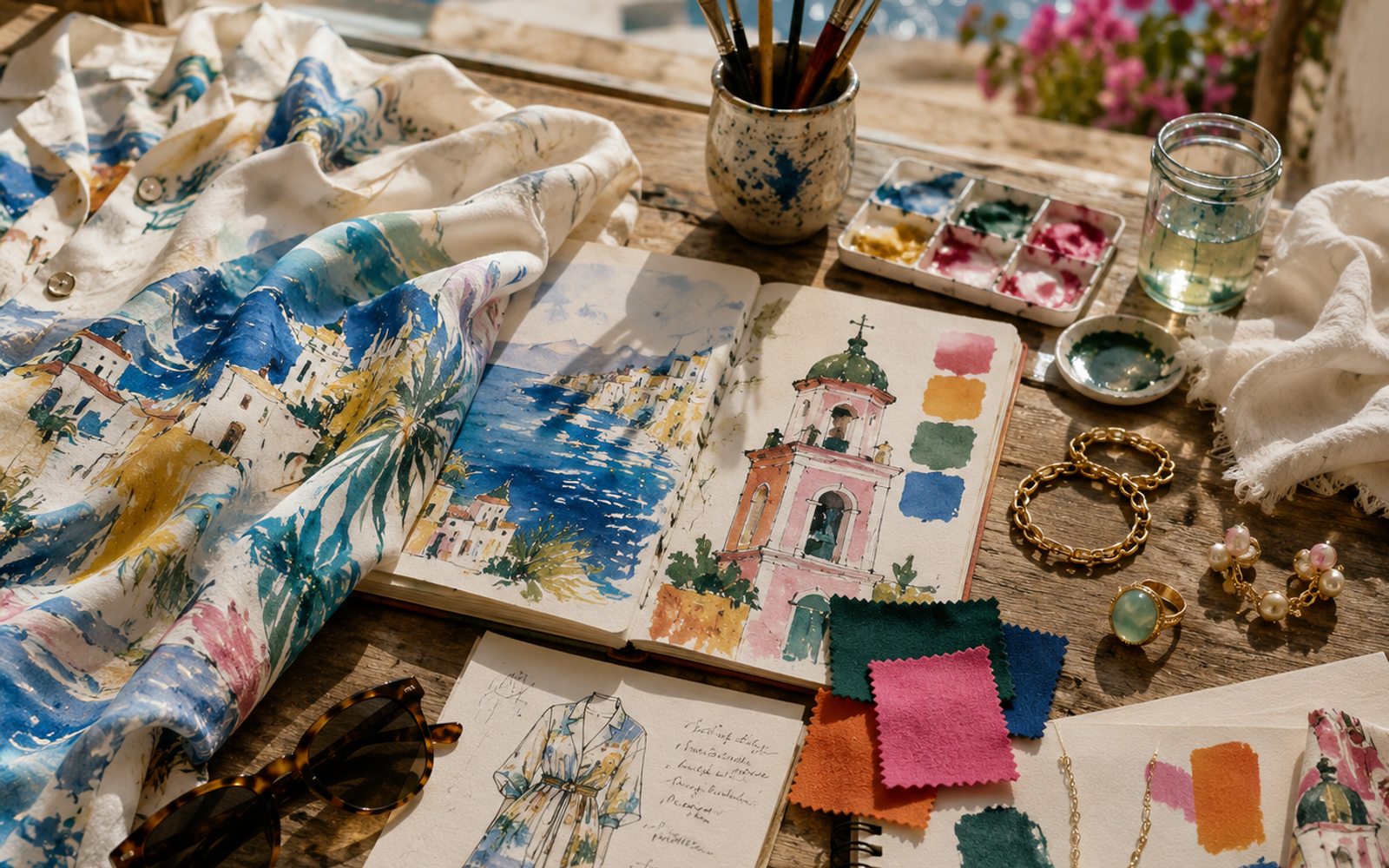
The cotton batiste shirtdress comes in two prints. One shows a beach scene, the blues are Mediterranean, the yellows the color of late afternoon sun catching white stucco walls.
It's a simple garment. Drop shoulder, relaxed fit, mother of pearl buttons up the front. Nothing revolutionary about the silhouette. Michael Kors has been making versions of this dress for thirty years. But the surface is something else entirely. Those illustrations, by Brooklyn based artist Christina Zimpel, don't sit on the fabric like a print. They feel woven into the logic of the thing, as if the dress was always meant to carry this particular seascape.
This is the Michael Kors x Christina Zimpel capsule for summer 2026, and it arrived in stores the same week Pomellato opened its first Paris exhibition at the Palais de Tokyo. Two events, different cities, different price points, different centuries of heritage. But they're telling the same story.
A capsule that doesn't feel like one
Capsule collections have become a tired format. Brand plus artist equals press release, a few tote bags, maybe a sneaker. The whole thing feels contractual, a transaction dressed up as a collaboration. Most of them vanish from memory the season they launch.
This one doesn't.
Zimpel created two artworks specifically for Michael Kors. The first is that beach scene, all saturated blues and warm yellows, the horizon line pushed high so the water dominates. The second is a stylized rendering of Saint Tropez's belltower, rendered in forest green, hot pink, orange, and white. It's an unlikely palette. Forest green and hot pink shouldn't work together. They look slightly wrong in a way that makes you keep looking.
That second print is the more interesting one. The belltower is a recognizable landmark, a piece of Mediterranean iconography that plenty of brands have used. But Zimpel's version doesn't feel like postcard shorthand.
The colors are too specific, the composition too off kilter. You get the sense that she spent time in that town, that she stood in the square and actually looked at the thing. The prints carry the weight of someone's attention.
The collection includes ready to wear, handbags, and accessories. A cotton batiste shirtdress in each print. A sarong printed with the beach scene. The Izzy small cylindrical pochette in grained leather, stamped with the tower motif. A tote bag large enough for a day at the beach, covered in that Mediterranean blue. The pieces are meant to mix, not match. Zimpel told the CFDA that Kors wanted the collection to "transport people to a beautiful Mediterranean dreamscape, colorful, easy, and full of life."
That word "easy" keeps coming up in descriptions of this capsule. It's the brand's signature "easy chic" aesthetic, applied to a collaboration. But there's something slightly misleading about that framing. These pieces aren't easy in the sense of being simple. They're easy in the sense of being resolved. The hard work happened before you saw them.
The Pomellato exhibition, Le Joaillier Révolutionnaire, runs at the Palais de Tokyo from June 24 to July 20. Curated by Alba Cappellieri, it explores the revolutions that have shaped the maison since 1967, style, craftsmanship, color, image, women. I wrote about Pomellato's approach to gemstone cutting last year after the Milan shows, and what struck me then was the same thing that strikes me now: the house treats color as a structural element, not an afterthought.
That's where the connection lives. Zimpel's hot pink and forest green, Pomellato's signature use of colored gemstones, the whole premise of treating color as something that carries meaning rather than decoration. Both of these projects are working against the current tendency toward safety in fashion.
The summer of commitment
We've been in a period of cautious dressing for a while now. Quiet luxury, stealth wealth, all that vocabulary that really means "don't offend anyone." The market has rewarded blandness. Neutrals sell. Logos that don't look like logos. Clothes that announce their quality in whispers.
Summer 2026 is pushing back.
Not in a dramatic way. This isn't the return of maximalism or some punk revival. What I'm seeing is something quieter but more consequential: a return to specificity. The Michael Kors capsule doesn't shout. But it commits. Those colors are not negotiable. The belltower print is not trying to be everything to everyone. It's a specific place, seen by a specific person, at a specific time of day.
The same applies to Pomellato's exhibition. The house is calling itself revolutionary in the title. That's a bold claim for a jewelry brand that doesn't need to make it. Pomellato could have curated a safe retrospective, the kind of historical survey that pleases institutions without taking risks. Instead, the exhibition dedicates sections to each of the house's revolutions: style, craftsmanship, color, image, women. It's structured as a argument, not a display.
I keep coming back to those prints. Zimpel made two artworks for this project. Two. A larger brand might have asked for twenty, created a pattern library, merchandised the thing to death. Kors limited it. One beach scene, one tower. The whole capsule flows from those two sources. That's discipline.
And it's rare. The default in fashion right now is more. More drops, more micro seasons, more collaboration partners, more product. Brands are competing for attention by increasing volume. Michael Kors went the other direction. Fewer prints, more specificity, and the confidence to let those two images carry the entire weight of a collection.
What the shirtdress knows
The cotton batiste shirtdress is not a new idea. It's been a staple of summer dressing for decades. But its persistence tells you something. The shirtdress survives because it solves a problem: how to look put together without trying. You pull it on, button it up, and you're dressed. It's a one step garment.
Zimpel's prints don't disrupt that logic. They enhance it. The dress still does its job of making you look like you made an effort when you didn't. But now it also carries a specific memory, or at least the suggestion of one. The beach scene print reminds you of somewhere you've been. The tower print reminds you of somewhere you haven't been but want to go. That's the function of good summer clothes. They project the self you want to be, or the self you imagine yourself becoming on vacation.
The Izzy pochette works the same way. Small, cylindrical, in grained leather with the tower motif stamped on it. It's a souvenir that doesn't look like a souvenir. You could carry it to dinner in the city and no one would think you were wearing a tourist item. But you'd know. And that private knowledge, the secret the object holds for its owner, is part of the appeal.
Pomellato's exhibition explores a similar idea. The house has always made jewelry that carries meaning beyond decoration. The colored gemstones, the signature chains, the emphasis on craftsmanship. These are objects that reward close looking. They don't announce themselves from across the room. They reveal themselves slowly.
Alba Cappellieri, who curated the exhibition, is a professor of jewelry design at Politecnico di Milano. She's an academic, not a commercial curator. That matters. The exhibition doesn't feel like a brand activation. It feels like a thesis, argued through objects. The sections on women and image are particularly pointed. Pomellato has long positioned itself as a brand for women buying for themselves, not for men buying for women. The exhibition treats that positioning as a design philosophy, not a marketing line.
The hand of the artist
Christina Zimpel is not a fashion illustrator in the traditional sense. She's a fine artist who works in painting and drawing. Her collaboration with Michael Kors started with the spring 2019 runway show, where she created the set design. That show transformed Pier 17 into a Mediterranean garden, with Zimpel's paintings serving as the backdrop.
Kors has kept her close since then. The capsule collection feels like a natural extension of that relationship, not a one off licensing deal. Zimpel's hand is visible in every piece. The brushstrokes, the way the colors bleed into each other, the slight imperfections that make artwork feel alive. Digital printing technology has reached a point where it can reproduce those details faithfully. The cotton batiste doesn't fight the print. It absorbs it.
The price points reflect the limited nature of the capsule. This isn't fast fashion. It's not diffusion. It's a small run of pieces meant to be worn for summers, not seasons. That's a bet worth watching. The industry has spent the last decade training consumers to expect constant novelty. New drops, new collaborations, new reasons to buy. The Michael Kors x Christina Zimpel capsule makes the opposite argument. Buy this, wear it, keep it.
Pomellato makes the same argument by different means. The house's jewelry is designed to last generations. The exhibition reinforces that message by placing the objects in a historical context, showing how designs from the 1960s still feel current. That's not nostalgia. That's durability as a design principle.
Where this is heading
I don't think we're seeing a trend toward artist collaborations. Those have been around for decades and will continue to exist in various forms. What I think we're seeing is a shift in how brands use specificity.
The era of generic aspirational imagery is ending. The beach scene that could be anywhere, the sunset that could be any sunset, the woman who could be any woman. Consumers have become too sophisticated for that. They can tell when a mood board has been assembled from stock photography. They can tell when a brand doesn't actually know what it's talking about.
The Michael Kors x Christina Zimpel capsule knows what it's talking about. It knows exactly which beach, exactly which belltower, exactly which quality of light. That specificity is the point. It's what makes the collection feel real in a way that most summer capsules don't.
Pomellato's exhibition knows what it's talking about too. The house has a point of view about jewelry, about women, about craft. It's willing to state that point of view directly, even in a city where understatement is the default.
I spent an hour looking at images of Zimpel's tower print before writing this. The more I looked, the more I saw. The way the hot pink sits next to the forest green, creating a vibration at the edge where they meet. The way the orange disrupts what would otherwise be a straightforward composition. The white space that keeps the whole thing from feeling crowded.
This is what I mean about specificity. The tower print is not a generic illustration of a generic landmark. It's a specific person's way of seeing a specific tower on a specific day. That's something you can't manufacture. You can only find it.
The cotton batiste shirtdress in that print costs more than a dress with a generic print would cost. It's worth the difference.
Not because of the brand name, not because of the artist's signature, but because someone actually looked at something and then made a record of what they saw. That's rare. That's worth paying for.
Both of these projects, the capsule and the exhibition, are asking the same question: what happens when fashion commits to particulars instead of generalities? The answer, in both cases, is that the work becomes more interesting to live with. Not louder. Not more expensive looking. Just deeper.
That's the direction I hope we keep moving.
Comments (0)
No comments yet. Be the first to share your thoughts.