The AI Chart-Reading Gold Rush and Its Limits
Asking AI to read a trading chart is now an app store category. Bullynx founder Antoine Duno breaks down what AI chart tools can genuinely see and where the illusion of certainty begins.

Not long ago, asking a computer to "look at" a trading chart was a research demo. Now it's an app store category. You upload a screenshot from TradingView, your broker, or your phone, and a few seconds later you get a trend call, a handful of support and resistance levels, maybe a pattern name, and very often a verdict. Bullish. Bearish. Here's the entry, here's the target.
I build one of these tools, so I have every reason to want the category to do well. That's also why I'd rather write the honest version. Vision models are good at one part of reading a chart, and they are blind to most of what actually moves a price. The problem with the current rush isn't the technology. It's that a lot of it is being sold as a kind of certainty it can't deliver.
What Happens When You Upload a Chart
It's worth being precise about this, because almost every limitation follows from it.
Your charting platform draws a picture from a price series. When you screenshot that picture and send it to a model, the model never sees the series. It sees pixels. To tell you resistance is at 187.40, it has to read the tiny numbers on the price axis, figure out how many pixels make a dollar, find the wick it thinks matters, and turn that wick's height back into a price. To tell you the trend is up, it has to recognise higher highs and higher lows from shapes.
So the model isn't analysing the market. It's analysing a drawing of the market's recent past, cropped however you happened to crop it. Humans read charts the same way, to be fair. But it puts a hard ceiling on what any screenshot tool can know, and most of the marketing in this space quietly steps over that ceiling.
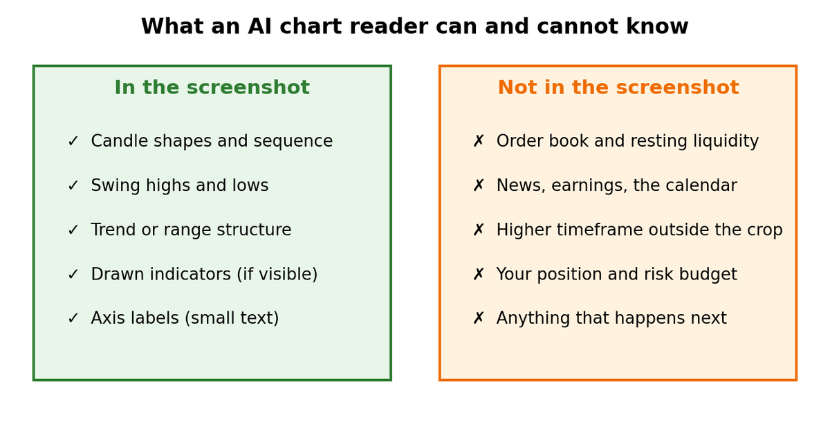
What an AI chart reader can and cannot knowWhat an AI chart reader can and cannot know from a screenshot.
The Part That Genuinely Works
I don't want to be unfair to the category, because the useful part is real.
Current models are good at the labelling side of technical analysis. They'll find the swing highs and lows, tell you whether a market is trending or ranging, notice that a level has held three times, and point out that price is stretched well above its moving average. Those are questions about shape, and shape is what vision models handle best.
They're also consistent in a way people aren't. A model doesn't get tired at 3:00 PM. It doesn't talk itself into a level because it wants to be in the trade, and it doesn't skip the checklist on the fifth chart of the afternoon. And it's fast, which matters when you're going through a watchlist rather than staring at one setup.
In my experience, the most useful moment with these tools is rarely some big revelation. It's the read that points out the higher low you glossed over, or that your "breakout" is running straight into a level that rejected price twice last month. Used like that, as a quick, unemotional second opinion on the mechanical work, they earn their place.
Where the Certainty Gets Manufactured
Things go wrong when the output slides from describing the chart to describing the future. Four gaps account for most of the distance between what these tools can know and what they're often sold as knowing.
Everything Outside the Picture
A screenshot has no order book in it, no tape, no resting liquidity. When an AI read says "sellers are defending this level", it's inferring intent from the shape of a few wicks. That's often a fair inference, but it isn't an observation.
News is the same. The model sees a gap and has no way of knowing whether it came from earnings, a Fed decision, or just thin overnight trading. It doesn't know CPI comes out in ninety minutes, which is often the single most important fact about the chart you're looking at.
And it can't see past the edges of the image. Send it eighty five-minute candles, and the daily downtrend, last month's weekly level, and the swing that scrolled off the left side simply don't exist. You'll get a perfectly coherent read of the window you sent, and it can point the opposite way from the timeframe that's actually driving price. Ask a language model about context it can't see, and it will often fill in something plausible rather than say it doesn't know.
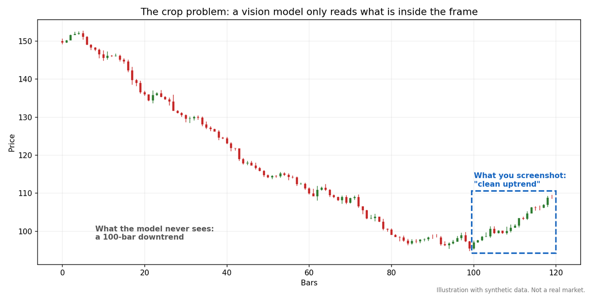
The crop problem. The screenshot shows a clean uptrend; the 100 bars the model never sees are a downtrend.
Prices That Are Estimates, Dressed Up as Measurements
Every level in the output comes at the end of a chain of visual guesses: read the axis, interpolate between gridlines, locate the wick. Each step adds error. A compressed image, a log scale, a cropped axis, or an indicator ribbon sitting on top of the wick will all shift the result.
You never see that error. "Resistance at 187.42" reads the same whether it came off a sharp, clearly labelled axis or a blurry phone photo of a monitor. One tell I've learned to look for: if a level is quoted with more decimals than the chart's axis actually shows, it was estimated, not read.
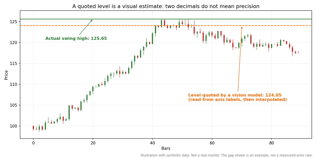
A level quoted to two decimals is still a visual estimate, read from the axis labels and interpolated.
Percentages That Look Like Statistics
Lots of tools put a number on their verdict: "Bullish, 78%." Some, including mine, attach rough odds to a couple of scenarios, and I think that can be useful when it's presented for what it is: the model's relative weighting of two plausible paths, which is a judgment. It turns into a problem when the same kind of number gets sold as accuracy. Unless a vendor can show you the test set, the time period, and what counted as "correct", a percentage produced by a language model while writing a sentence tells you about the sentence, not about its hit rate.
This matters because retail traders size on conviction, and a number creates conviction. Regulators have noticed. The SEC has gone after firms for "AI washing", meaning overstating what their AI actually does, and both the SEC and FINRA have warned retail investors to be wary of AI-driven investment claims. A headline accuracy figure with no methodology behind it is pretty much the textbook example of what they're warning about.
Same Chart, Different Answer
Upload the exact same screenshot twice, and plenty of tools will give you different levels, sometimes a different direction. Part of that is just how language models work. Part of it is that support and resistance are judgments, not measurements. There's no official rule for how many touches make a level or how wide a zone can be.
If you're following one setup over several days, this is the practical headache. When the read changes, you can't tell whether the chart changed or the model did.
The Marketing Tells
Working inside this category, I've got a short list of claims that make me suspicious straight away, whether it's a competitor making them or I'm tempted to make them myself:
- A single accuracy or win-rate number with no test set, no date range, and no definition of a win.
- Price targets presented as predictions, with nothing saying where the idea would be wrong.
- "Buy" and "sell" signals from a tool that has never been told your position, your account size, or how much you're prepared to lose.
- Anything claiming to read "smart money" or "institutional flow" from a screenshot, which contains neither.
- And a product site with no limitations written down anywhere.
None of that proves a tool is useless. It does tell you the vendor is selling certainty, and certainty is exactly what a picture of past prices can't contain.
Using One Without Getting Hurt
The way of working that holds up in real markets is fairly narrow, and it keeps the judgment with you:
Make your own read first and use the tool as a check. If you look at the AI output first, you'll anchor on it, and you'll stop seeing the chart.
Try it on the same chart twice. It costs nothing, and if the direction flips on identical input, you've learned how much weight it deserves.
Give it clean input: a proper screenshot at full resolution, price axis visible, ticker and timeframe in the frame, and none of the indicators you aren't asking about. A lot of bad levels are really bad screenshots.
Bring the context it can't see. Check the calendar. Look at the higher timeframe yourself. Treat anything it says about news, flows, or "participants" as a comment about shape.
Insist on an invalidation level, the price at which the idea is wrong. A read that tells you that can be tested, and you can size a position around it. A read that only tells you where price is going can't be tested and can't be sized.
Check every number on your own chart before it becomes an entry or a stop. The price levels are the least reliable part of the output, and not by coincidence, they're the part people copy straight into their broker.
And keep the risk decision. The model has no idea this would be your fourth trade today, or that you're already down on the week. Most of the gap between a good chart read and a good trade is made of things the model was never told.
What an Honest Tool Looks Like
The version of this technology I think is worth building is one that tells you what it can't see. It reads only the image you gave it and says so. It frames levels as zones tied to reactions you can see on the chart. It gives the same structure every time, so two reads can actually be compared. And it always says where the idea stops working. What it doesn't do is quote an accuracy percentage that nobody has measured.
Vision models have made the mechanical half of chart reading faster and more consistent, and for retail traders that's a real step forward. The other half—the context, the risk, and the decision itself was never in the picture. Any tool that tells you otherwise is selling you the gold rush, not the gold.
Comments (0)
No comments yet. Be the first to share your thoughts.